Cinematographer Zach Kuperstein and senior colorist Sam Daley on Barbarian
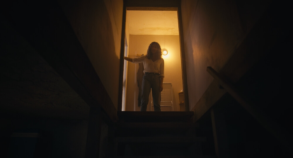
When cinematographer Zach Kuperstein got the job to shoot writer-director Zach Cregger’s horror feature Barbarian, one of the first things he did was reach out to Light Iron senior colorist Sam Daley. The two had previously worked together on a short and three independent features — The Eyes of My Mother, The Vigil and Paper Spiders — but their collaborations began during post, not during preproduction. For Barbarian, Kuperstein was able to shoot tests and then work with Daley from the start to create a shooting LUT that would match Cregger’s vision for this mind-bending story of a girl (played by Georgina Campbell) who arrives at a house she’s booked for the night only to discover a young man (Bill Skarsgård) has also rented it.
To give Daley an idea of what he and Cregger wanted, Kuperstein assembled a short look book of photographic references that defined the movie’s tone and mood. The book included stills from the features Prisoners, Gone Girl and Sicario for night interiors, It Comes at Night for flashlight scenes, and American Beauty and Pleasantville for a 1980s flashback sequence. “Texturally we tried to keep it limited,” the cinematographer explains. “It wasn’t too built-out or complicated. I find it best to keep the references really tight because otherwise it’s hard to articulate exactly what it is about each image that is related to the color.”
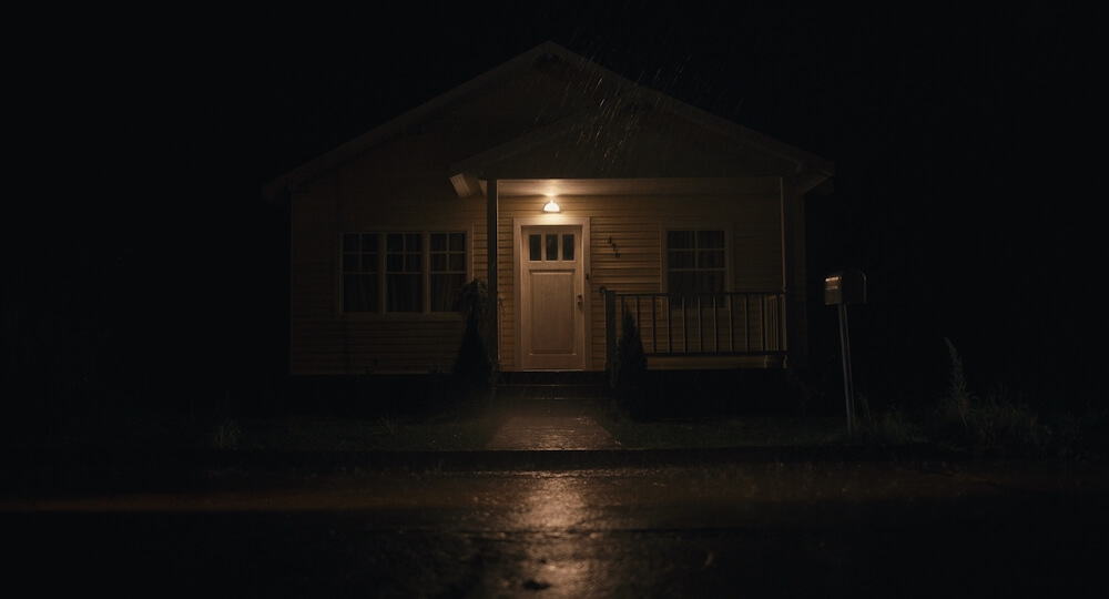
Barbarian is set in Detroit but was shot in Bulgaria, where infrastructure limitations made it difficult to reliably share footage from set with Daley in New York. So, Daley explains, “Zach came up with a lo-fi way for us to exchange images and LUTs. He would shoot a test, and instead of sending me terabytes of files to look at, he would send me high-quality DPX still frames, which he could easily email or put up on WeTransfer or Dropbox.”
Kuperstein was grateful for Daley’s partnership throughout this testing phase. “It was great to get Sam’s eyes on the footage and his guidance on where we could or where we shouldn’t push the camera,” he says. “We shot with the Sony Venice, which I hadn’t used before, so I was like, ‘Can I go to 5,000 ISO? Can I go to 10,000 ISO?’ And Sam said, ‘Don’t go to 10,000 ISO, but go to 5,000 if you need it.’ His guidance was super-helpful, and paired with the test footage, it made for a robust LUT that we could use to shoot everything.”
The shooting LUT Daley provided was set for a color temperature of 4300° Kelvin, approximately halfway between tungsten and daylight, giving Kuperstein the ability to use the LUT in any type of lighting situation. “It was just something to get in the ballpark while Zach was on location in Bulgaria and working really quickly,” Daley says. “When we circled back after the edit to do the final color, I came up with another series of looks, and it was ultimately Zach Cregger, the director, who decided which of the looks he preferred.”
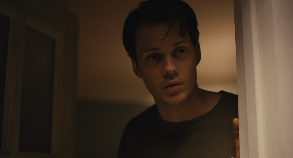
Kuperstein and Daley kept their lines of communication open throughout principal photography. “I usually don’t work with a DIT on set, or somebody live-grading, or somebody else judging exposure with me,” the cinematographer says. “Having Sam to bounce that off of throughout the production was really helpful. He helped me make sure the exposure was giving us a lot more depth in the shadows, which I’m glad we had.”
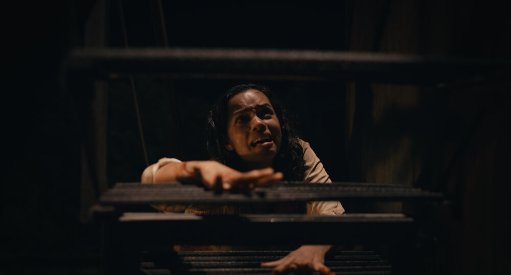
Both on set and in the final grade, Kuperstein always strove to keep the lighting tethered to reality. “My approach is very much about motivated lighting,” he says. “I try to find whatever sources are in the room or in the space that make sense for the scene. At times those could be sodium-vapor streetlights outside, tungsten or fluorescent lights inside, or a mix. From a lighting perspective, it’s often about keeping something bright in the background so you can make the rest of the image dark — you can get away with it being darker if there are highlights in the image. Then, in the grade, you’re making sure you aren’t losing those highlights and are bringing out that contrast wherever possible.”
“Similar to what Zach says about motivating light sources, that’s what I always do,” Daley says of his process. “It’s got to feel real so that somebody is going to watch and be engaged in the story. Then I flavor it with whatever’s going on and create mood with contrast or a slight hue change to help tell the story through color and contrast choices.”
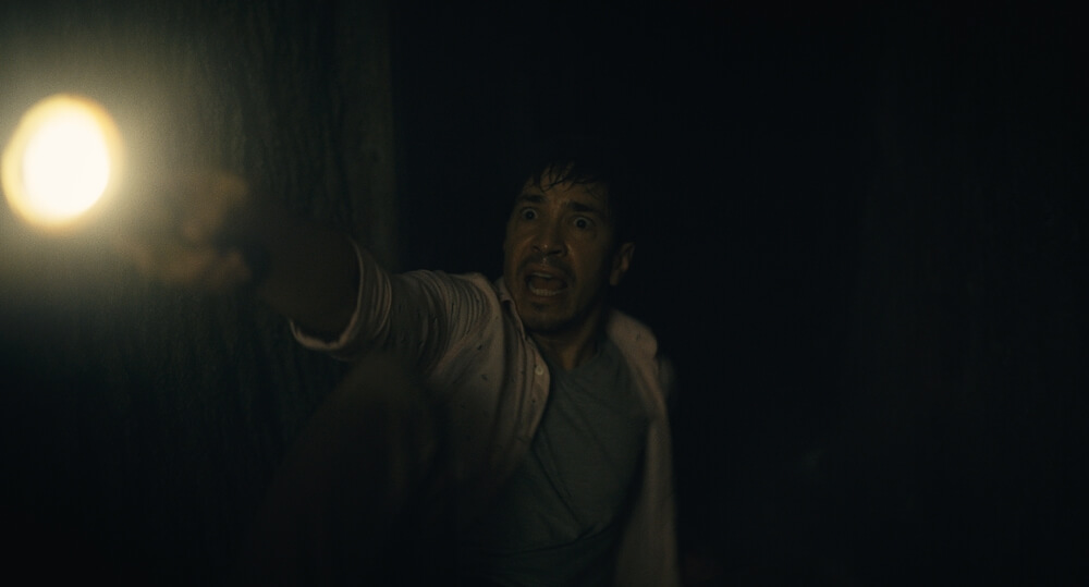
For the color grade, Kuperstein and Daley worked together in person at Light Iron New York while Cregger split his time between Light Iron’s New York and Los Angeles locations. Based on the locked picture in combination with Kuperstein and Cregger’s notes, Daley began by offering a range of looks for the filmmakers’ consideration. One option offered a grainy, bleach-bypass, cross-processed look; another was much more subdued and classical in style, with a Kodak film feel. The opportunity to see the opposing looks helped Kuperstein and Cregger make their choice. “I’m glad we got to see the extreme look even if it wasn’t the direction we went with,” the cinematographer reflects. “It was good to test the waters with that and see how Zach responded to it. He reminded us that we weren’t trying to tip our hand too early and that we needed to play it more neutral. When we saw the Kodak look that Sam put on it, the colors just popped into life and the whole film felt fresh.”
With the film look they landed on in the final grade, Daley adds, “We did deviate a little bit from what we had in the testing. But it wasn’t a very assertive film look. It was more subtle.”
The overall palette for the interior of the house tended toward the warmer range of the spectrum. “I like to look at the color palette of the production design and see what I can lean into,” shares Daley, who graded the project with Blackmagic Design’s DaVinci Resolve. “There was a sense of warmth inside the rental house that both Zachs wanted to make feel welcoming and not like you’re walking into a horror movie.”
Exteriors and certain rooms in and under the house had their own individual look and feel. “There’s the pink room, and there’s another room that was called the ‘tiny room,’ which we played as very green,” Kuperstein notes. “There’s also a dark night scene where there aren’t supposed to be any lights on, and we played that blue.”
The movie’s 1980s flashback was one sequence where the filmmakers departed significantly from the original LUT. First, Daley applied a base correction that more closely imitated the look of films like Pleasantville. Next, he pushed the color saturation to a high intensity, and then he suggested that they apply a video-noise filter instead of the film-grain emulation that was applied to the rest of the picture. The results amazed Kuperstein and Cregger. “That whole section stood apart and popped and felt unique,” Kuperstein says. “I think it paired well with the different style of camerawork that we’d put into the flashback, and it’s also a different aspect ratio, which fit perfectly.”
If there was one overarching goal the collaborators shared for the grade, it was to avoid the clichés of the horror genre. “Thematically, I would say that we were playing down the horror element so that the audience would think, ‘Oh, they’re playing down the horror, so it must be a horror,’” Kuperstein says. “But at the end of the day, it’s about the characters and the story and the narrative. That’s what guided the direction, the cinematography, the color grade — everything.”
Daley agrees with Kuperstein’s assessment. “I try not to think of this as a horror movie. I just think of it as a movie and then react to the story,” he says, adding that the creative relationships are what he values the most. “Just working with both of the Zachs and helping them realize their vision on the screen is the rewarding part of it. That’s how I feel with every film and every filmmaker. I love the collaboration. I love being in the room and creating something. I’m about the process.”
All images courtesy of 20th Century Studios.